Kibbutz-Ir
(Kibbutz in the City)
Study Project
Branding for the Kibbutz-Ir movement –
a movement seeking to provide an alternative to city living through community-building within neighborhoods and buildings, to enable a different and varied lifestyle.

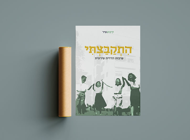
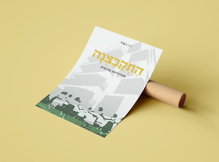
The logo brings together the kibbutz and the city – the itstrubral font – influenced by the classic Tzvi font – combining a nostalgic-contemporary look, with a Brenda font characterized by trapezoid shapes associated with cities and urbanism.

About The Kibbutz
Israel was established by the establishment of kibbutzim across the land. They represented the Zionist project and an example of solidarity and mutual guarantee among the founders.
Throughout the years, kibbutzim became weaker, and the move to large cities increased.
The need for community increased among city-dwellers given the changes to the work day, house chores, epidemics and more.
The branding language for Kibbutz-Ir is nostalgic and contemporary.
It details Israeli memories of the old and good Land of Israel, with thriving kibbutzim, and but also targets the present day – large cities, crowded with buildings and the hustle and bustle of everyday life.
The language calls on residents to gather and come together, like the old days, by using archive images of agricultural work, folk dances and celebrations.
The branding